Sunday 28 August 2011

Gawsworth Craft Fair. 28.08.11

Today I visited the Gawsworth Hall, food and craft fair. On stunning grounds the crafts, in 3 large marquees, were great. 


Monday 22 August 2011

Favourite Martin Haake Moments...

I have chosen 3 of my favourite Martin Haake's images.

Image 1,             Cover for 3x3 magazine, selected for "communication arts" annual.
This image is made up of textures, shapes and symbols to create a bold soldier figure against a simple textured background.
The figure seems huge in scale with a triumphant curved body in comparison with his small head. The male figure is broad shouldered and muscular with a confident stance, he doesn't look like he was/is in battle but on parade or show of achievement. His uniform looks smart showcasing stars on his impressive and tassled shoulder pads and also his array of stunning medals that fill his torso. His sword is attached to side side but his hand is close by, just in case.
The figure seems exactly central in the image, with his fastening seams and buttons outlining the middle, this central vertical seam adds to the structure of the figure giving him a stern grounded feel.
His bright pink head adds to his manliness, showing emotion and recent triumph. this colour also runs through his stars and cuffs, although his hands are not in the matching pink but the left one is beige, while the right hand is merely a transparent line drawing, I think the left hand being beige is because it is close to his sword it is not relaxed, still restless and full of adrenaline encase it is needed again.
His array of medals are of mixed media, line drawings, collaged elements, ect, this shows diversity with the soldiers talents and with Haake's artistic talents.
The main shapes are made from block colours of printed texture, the background is contrasting colour scale with the lighter colour, yellow, being the dominant colour with is overlaid by the faint smears of black, which seems to be a more oil based like gum arabic.


Image 2,                       Book illustration for 'Charge' by Justin Pollard
This image again just uses few shapes and colours to compose a simple layout. Using a collage technique from found elements and made textures the image is of 3 male soldiers resting against separate trees, they are wearing similar uniform but in different colours, blue, pink and beige, I don't think this is to show that they are on opposing sides of the battle or are different ranks but just to look more aesthetically pleasing.
The 3 men look relaxed, chest out and high to show that they are resting and have a manly physique, while their one hand, that is showing, is behind their head, they are so relaxed that one soldier has lay down his gun and another has took of his hat, I don't think there will be an threats any time soon.
Again the image is formed by print textures  but with some collaged shapes. The background is very interesting, two slightly parted irregular shapes forming the foreground of land and background, one is made from a section of delicate hand-written text, the other from a busy geometric pattern and this leaves a large white space to the right, giving is a dream like feel. Even with all the repetition in this image, the 3 soldiers, the 3 trees, the section of text- which forms more of a pattern then legible text and the geometric patterning, the image still has a sense of calm.


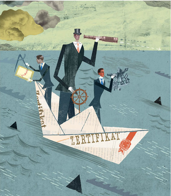
Image 3,                                   Illustration for WIWO magazine.
This image is under the section 'collage' from Haake's website, even though most of his other work is based on collage, this section houses the images that use digital heads.
This image is more active that the others I have selected, it is of 3 men sailing a paper boat in the ocean, the boat appears to be quite settled in the water with faint movement lines around it and no sharp waves but the men seem to be working hard to navigate the boat with telescopes and protractors. The origami paper boat reads 'zertifikat'- this is a internationally recognized German language exam.
The 3 men are wearing smart navy suits with ties but the central, larger man, has more interesting red tie and top hat, this man seems be more dominant and in charge of the boat, he is central, larger in scale and is controlling the wheel so is therefore the captain, like Image 1 this man has broad shoulders and chest with a smaller head which emphasis his impressive body. The ocean is of a less pigmented texture, with a variety of different waves of line and block shapes, the ocean also has black triangles dotted around, this could also be waves or shark fins. The clouds appear to be photographs of clouds and are gathered in the left corner behind the boat, this could mean that where the men are heading could be brighter in terms of weather conditions and in future life. The sky is similar to Image 1 with the pale yellow and streaks of faint black. The boat appears to be central in the image but at an angle, where as the 3 men and their tools are in the 'golden section' of 3.

Sunday 21 August 2011

Christina Song

 I have only recently come across U.S Illustrator, Christina Song. Her work is mainly collage based, using all hand crafted textures.


I find that this kind of style really connects with me, I am trying to produce more hand made textures for my own work.
Her collage and sketchbook work from her website is mainly based on landscapes, I admire this as I have not yet attempted to collage a scene, but I'm not sure if she would benefit from introducing figures, I struggle to create a language for my figures myself but I think her style could be well suited to a character.


The above image is one of a small selection of Song's images to use a lot of white space, it also only uses a small amount of colour, to me this emphasizing the pale pink colour and gives it a rich Spring blossom feel.


The wide range of textures really inspires me to produce more of my own, to research and try new techniques, Christina Song kindly shows on her website some of her techniques used.

Anna Lewis

I feel you can express a lot through jewellery, personally I don't wear garish clothes or have 'I'm unique' hair but I do like to have statement jewellery on. Its a subtle way of showing flare.

 
Anna Lewis.
Contemporary Jewellery designer.

Her work is based on concepts and symbolic interpretations of memory, superstition and fantasy.


Above,
The use of bare wire against dense beads creates emotion within the piece, worn this would be a strong statement piece.


Above,
The obvious contrast of the two sides, the purity of the white peals against the black and turquoise, makes me think of good witch, bad witch from 'The Wizard of Oz'.


Above,
This piece is more fresh, the one black bead gives it weight against the simple and breezy beads.

Saturday 20 August 2011

Current industry. Chrystal Falcioni - Magnet Rep

Artist Representitive from Magnet Reps answers the question:

What changes in the illustration industry have you seen in the last 10 - 15 years? What are some recent trends?

- I feel that there was a swing toward photography for a while there but in the last few years I've seen that illustration is getting more visibility and credit, and with greater success and return for clients.

- There are substantially more illustrators now than there ever were before. This may in part be due to the 'manipulated photography' as illustration trend and the 'graphic design work' as illustration trend, but I believe it is also attributable to what appears to be an expansion of illustration, animation and even comic book art programs in many art schools around the world. There is a lot more competition for illustrators out there now.

- The art directors, creative directors, designers and art buyers that have jobs are under greater pressure to perform at higher levels than historically expected and with less resources and support staff.

- Illustrators started selling stock artwork to and through large stock agencies for low prices. The illustrators that I hear complaining about stock are primarily the illustrators that sold their work as stock. My advice - don't do it and you'll never be sorry you did.

- Stylistic trends: Very clean, slick and slightly stiff digital illustration has been popular for a while now, as is a style that I would describe as looking like 'information graphics', but clients are starting to get bored with this. I don't want to scare artists that just render color digitally - that's not what I'm talking about. I often hear the words 'authentic', 'painted' and 'hand-made' coming up lately. Graphic novels are a trend, as is the concept of the illustrator as a writer as well - but beware, just because you can write does not mean that you should. Be self-scrutinizing and if that fails have someone else scrutinize the writing. Bad writing will bring down good illustration. Lastly there has been a flood of illustrators that generate their work from photographic imagery and manipulate it slightly in a few different ways to create an illustration. This is a trend that has been jumped on by artists at an alarming rate (it is by far the largest number of representation inquiries we receive) and I can only assume this is due to the fact that - sorry - it's got to be pretty easy to do. My advice here - find another style, there are already too many of you out there and the luster of this style is starting to tarnish.

Stockport Jewellery & Craft Fair. 20/08/11

Today I went down to Stockport Town Hall for there jewellery and craft fair, it was one of the best craft fairs I've been too, I should have known the best would be local!


There was lot's of stall full of things I am interested in, jewellery, cushions, cards, materials, beads. I loved it all! I find events like these very useful, they are full creative ideas and helpful and polite people that are happy to answer questions and share techniques.

I bought some charming beads and jewellery charms one stall, I bought them for my personal enjoyment rather than for trade.


Friday 19 August 2011

Salford Outlet Craft Stalls 19/08/11


Today I visited Salford Quays to look at the craft stalls in the Outlet Mall, I have not been to Salford before so I was looking forward to it. 

There were only a few tables set around the Outlet and they didn't display much, I was really disappointed, as I had expected a bigger event.

 
But I found the architecture around the Quays to be very interesting, with its unusual angles, modern high rise buildings, the Millennium Bridge and of course The Lowry.


I decided to take a walk around The Lowry to see 'Lowry Favourite’s' and the current 'Warhol & The Diva' exhibitions. Not a very big gallery but I appreciate that it's free admission. The 'Lowry Favourite's' exhibitions shows some lovely work, especially interesting to me was to see his sketches.

Admittedly I do not know a lot about Lowry, but in the exhibition I thought I would recognize more of his work, as the exhibition consist of the "Favourite’s", I didn't notice many of his more famous pieces.

Thursday 18 August 2011

Tom Edwards - The Mommoth Collection

Tom Edwards is an Illustrator based in London with a line-drawn style of illustrating but it was his series of landscape prints created for the online print shop Mammoth that really interested me.

Above,
This piece has a balanced feel to it, to the left and right of the central plant are heavy cliff-sides/rocks, although these are not symmetrical the formations seem balanced. The whole piece feels calm, the hint of water on the left rock along with the central plant makes it feel peaceful and welcoming.


Above,
I find that the block colours really tie the images together, the above piece uses yellow, the yellow in the top area being bold and in dominant shape, whereas the yellow in the bottom right seems to fade, the shape at an angle seems like its melting away, this could be linked to the image as it is set in an arctic area and could be showing climate change and the difference in the conditions.


I feel this collection expresses growth, nature and nurture.

A simplistic style, like his line illustrations but I find these have a different dimension, looking closely Edwards has only used photography of the elements he wants to portray, e.g, tree for a tree, I feel that this could have been pushed further by looking beyond the elements and finding similar textures from alternate objects.

Ana Himes

Ana Himes is a talented photographer, her photographs are very deep and poetic,


Above,
A simple everyday object, the light bulb, but taken out of modern setting of a house hold fixture or a supermarket box with simple graphics and shown in a dated shop and display.
Feels like its from a different and not as privileged country. Feeling of dry and emptiness.


But Ana Himes also works with collage, her work is different to my current style but I like to use of composition as the key factor.


Above, 
The bold lines surrounding the figure are simple shapes yet strong, I have used a similar technique in past collage work and always found it effective was to draw the viewers attention, to symbolize strength or to balance colour.


Above,
I like the use of the simple corrugated cardboard as a surface, very understated but it works well, especially as it is a high quality photograph so all the textures, shadows and colour is clear.


Tuesday 16 August 2011

My Jewellery

A bit of a bad day today, I sat down to do my 'homework' for uni and found myself making jewellery all day! Procrastination should be my middle name, although I was quiet pleased with them so it could of been worse.


Holli Conger


While researching into children's illustrations I came across illustrator, Holli Conger. At first I wasn't drawn to her images, all of the children's images I found were understandably simple and I expected the same but was happy to find something different. Found Elements!!


I love this space piggy, not sure I want to know the reason behind it as it may crush my dreams!


As I have mentioned before I have an interest in studio space, sometimes more than I have for images, so while looking through Holli Congers website, I was chuffed to see some pictures of her studio space, that quickly turned to envy, haha


Miss Clara


Leaf Art


Leaf art of Lorenzo Duran

 
These are amazing! 
Nature crafted out of nature, think I need to try something like this and mix it into my collage work, working into my media sounds fun.
Just looking at them teaches me to slow down a little, they are a true example of patience and precision, I think I need to learn from them.


History
"I started by noticing that there are various techniques for cutting paper. Probably the master of paper cutting are the Chinese, whose expertise dates back for centuries. The symmetry in their designs and lace are spectacular. The Japanese also have a long history in paper cutting, which they call Kirigami, typically performed using scissors.  The German and Swiss also have a long history of paper cutting (which they call scherenschnitte), and rely heavily on symmetrical motifs.
"