I contacted one of my all time favourite Illustrators, Blanca Gomez asking if she would kindly answer a few of my questions that I had lined up when I came across with interview by Grain Edit where I found that they have asked the majority of the questions I was going, and a lot more..
Where are you from originally?
I am originally from Madrid and that is where I currently reside. I am always saying that I’d like to move somewhere else for at least a while, but here I am. I suppose underneath it all Madrid isn’t so bad.
Tells us a bit about your art/design background. Where did you study?
When I was little I would draw all day long like many kids do and my parents enrolled me in a painting academy. I would always say that I wanted to be a painter, but as I grew older I didn’t see it as a feasible option and the idea faded.
When it was time to head to college I wasn’t clear what I wanted to do with my life. I had always considered drawing a hobby, but never imagined it as one that could earn me a living. Instead I chose to study Publicity because I thought it would lend itself to creativity and aide in my professional development, but I soon realized that Publicity was not for me.
I continued my studies, but explored other alternatives like photography and film through my fourth year, which I spent in Milan. It was in Milan that I became interested in graphic design. I remember attending an eye-opening exhibition of Milton Glaser’s work and somehow finally figuring out what I should do. When I returned to Madrid I enrolled in evening classes at a design school while I wrapped up my publicity studies. I was in classes all day until 11 P.M. and it was very exhausting but well worth it in the end.
One month after finishing college and my design coursework I began working for a small graphic design studio that was mainly dedicated to the production of business literature. That is where I learned to work in a very rigorous and precise manner. I’ve been working for graphic design studios for seven years now.
When did Cosas Minimas begin and how has it grown?
Cosas Minimas got its start several years ago in a very curious way. I was working for another graphic design studio at the time and was in the habit of constantly drawing on post-its. Most of the drawings ended up in my wastebasket and my boss would tell me that I should do something with those drawings, but I never paid much attention. One day he simply told me that he had chosen a name for my website and purchased it for me. So it just naturally morphed out of what was once merely a hobby at work.
What was initially meant to be a personal project gradually and naturally turned into a professional project. Having a site dedicated to my personal projects forced me to learn more and more. As time went on I began dedicating more time and effort into Cosas Minimas. That is how my first commissions and collaborations came about, always via the web, until finally my hobby became my primary job. It’s not like I had a plan or predetermined objective, it just happened. These days Cosas Minimas continues on its undefined path; dividing my time between personal projects, the store, and commercial commissions.
What inspires you most?
To be sincere, I’m not too certain what inspires me. I suppose that everything that surrounds me and everything that I like inspires me inevitably. I’m a huge collector of objects and books. Picasso said something along the lines of it being best for inspiration to find you working, I happen to think that’s good way to put it.
Which artists/designers do you admire and/or are inspired by?
Given the easy access we have to thousands of good artworks today, it
is impossible for me to recall all of the artists that interest me. Moreover, the Internet has produced an interesting phenomenon thanks to sites like ffffound, and I believe that many works have come to
eclipse the very artists that produce them. It seems these days we are more likely to recognize an image or style long before we know the artist. I find this interesting because in the end it is the work itself that matters most.
Let’s try anyway: The French illustrator Sempé has stuck with me since I was little and read Nicholas. I love the tenderness and humor in his illustrations. Other illustrators that are among my favorites include Dupuy and Barberian who also illustrate comics. I’ve always been very interested in Comics. I also like many Japanese illustrators. I recently discovered Tatsuro Kiuchi and the simplicity in his drawings, especially those in black and white, I found to be very impressive.
As far as designers go, I am clearly a fan of mid-century design, above all else people like Alexander Girad(especially), Olle Eksell, And Bruno Munari. Presently, I am smitten with Vostok, a Catalonian studio that employs unimaginable printing techniques. Another illustration favorite is illustrator and designer Cristobal Schmal who also happens to be a colleague.
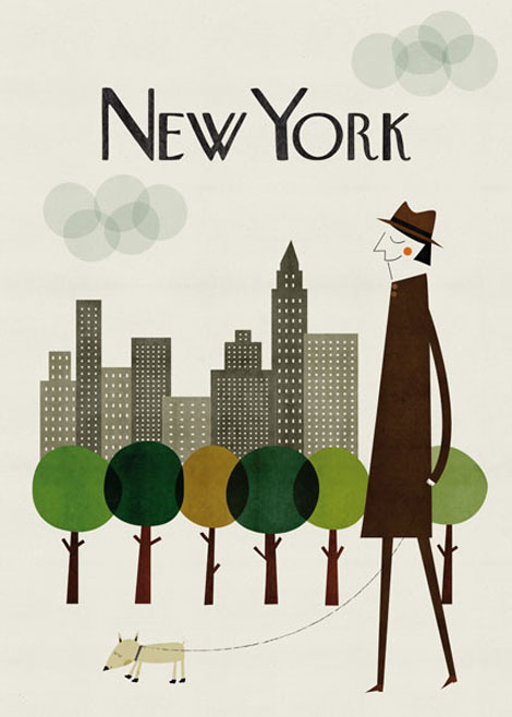
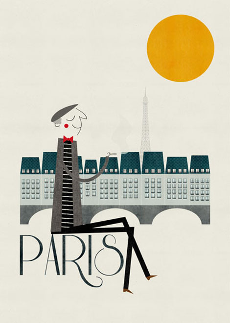
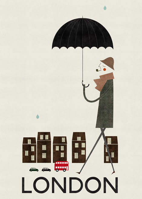
You mention your love of mid-century design and that’s clearly an affinity you share with Grain Edit. Would you agree that during that era of design it was much easier to identify where work was coming from than it is today or can you identify any regions around the world that have made their work unmistakable?
Although it is evident that it is becoming more difficult to identify where work is coming out of I think there are certain countries that continue to hold personal characteristics that are very identifiable. Clearly this is my own subjective opinion and without any solid backing. For example, I think that the design from the Nordic countries of Europe maintain a style that is recognizable and all their own. Their illustrations maintain certain characteristics that are common to their work. There is a common simplicity in style with great expression underneath it all. There are also many Japanese illustrators, especially for children, that when you see their work you know that it can’t be from any where else in the world.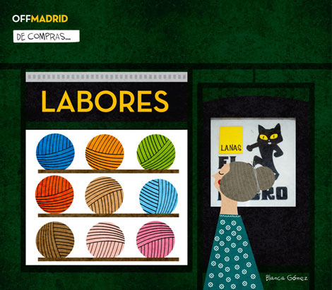
You say the Internet has brought about interesting phenomena and that your first commissions and collaborations found you via the web. How has the Internet influenced your work and how do you think it will continue to evolve?
Not just at the beginning, today my clients continue to find me via my website as the Internet helped mark a significant point of flexion in my career. If it weren’t for the Internet I would probably still be working on more corporate type projects because at the time I lacked the confidence needed to contact potential clients to present my personal work. Moreover, if I had to promote my work in other ways it never would have occurred to me to do so outside of Spain. Today, the majority of my work is done for foreign clients and that truly widens my professional horizons.
I also have an online store and I communicate with clients via email. And thanks to the Internet I have met colleagues that I speak to on a daily basis who keep me from going crazy as a result of working alone. My blog is another way that I get feedback about my work.
In any case, what I am saying is rather obvious. I suppose that in the future things will continue to evolve and I don’t see myself working any other way. Sometimes I think that in the future I would like to interact more directly with my clients, but then I remember the closeness of clients when I worked at an agency and realize that it’s possible to be much closer to a client thousands of miles away than face to face.
Can you tells us about any projects you’ve been involved in that you’re particularly proud of?
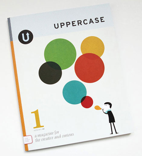
It’s not a project in the strictest sense, but I was very flattered that Janine Vangool chose an illustration of mine for the cover of the first issue of Uppercase Magazine. I had never before seen my work featured on the cover of a magazine much less the first issue and now I fear I won’t see it again. The best part is that my work was on the cover of a fantastic magazine, but I feel honored more than proud.
On another note, I’ve just finished a series of greeting cards for Carrie and Hal of Red Cap (they’re lovely people). They asked to use existing works, but when I proposed new illustrations for them they accepted and gave me free reign when it came time to work. I think this will be obvious when you see the final results. I am very happy with the final product and recently had a chance to view some samples. They left a great impression and I can’t wait to see the real thing. Generally I feel most proud of my personal projects over my commercial projects.
It sounds like you’re involved in a lot of fun and interesting projects. Is there anyone you’re interested in working with or for?
I am lucky to have a collaborative project pending with some friends that aside from being my friends also happen to be really great at what they do. The less positive side is that the project is currently stalled because of me. In reality, the paradox is that I am rather individualistic in my work and I’ve been used to working alone for a long time. On the other hand, I would like to collaborate with so many people that I am incapable of naming just one.
I would like to see my work in other arenas and in mediums that at first glance appear distant from my own work, a line of skateboards, wooden toys, or textiles for example. So if anyone out there would like to reach me you know where I am!
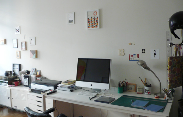
Blanca’s studio
Can you walks us through your work flow?
While my process for commissioned work is very disciplined (whenever possible), I don’t have a predetermined process for personal projects because I work chaotically. The following work was commissioned, but has a very personal touch. The client gave me free reign in the production of limited edition prints for his store. The store specializes in music posters so my first idea was to make a fake poster billing for a fake concert. The turning point came about while listening to the song Autumn in New York, I decided then I would do something Jazz inspired with New York as the backdrop.
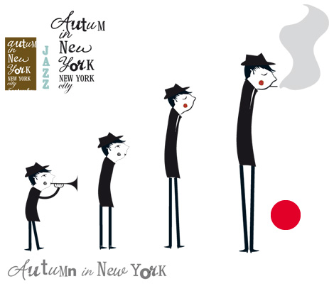
Sometimes I sketch on paper and others I start sketching in Illustrator. In this case I decided to start drawing (in Illustrator) the character playing the trumpet in basic shapes. The first character was too silly or caricature like for the idea I had in mind. I eliminated the trumpet and began to style him. Once I have a clear idea of form I begin experimenting with various brushes. I also experiment with fonts for the text.
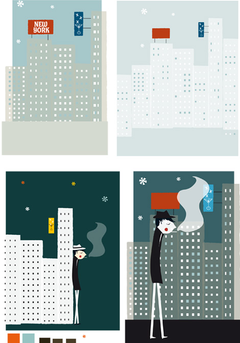
Once the character is defined I begin to work on the background and play with color. The title of the song inspires a melancholic image (blue) and I decide to experiment with a palette of cool colors. This process can be somewhat chaotic and I can have as many as 20 different versions in one document, but here I’m sharing fewer samples.
As I work on the background I incorporate the character into the composition and move him along the landscape. I lose the fake poster idea because at this point I’m aware that the illustration has overshadowed the design.
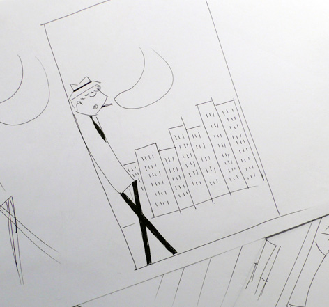
After several hours of trial and error there is nothing I like. I decide to leave the computer and sketch on paper. These sketches are quick and rough in order to get some idea of the composition of the elements. When I do this I recognize what is wrong, the character and the background are too similar and this is confusing and the character is lost in the background. I decide to reduce and contrast the color palette and also change the size of the elements. I reduce the cityscape and make the character more prominent on a first plane. Now it is night in the drawing and there is a protagonist in sight. I think this will work much better.
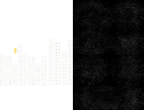
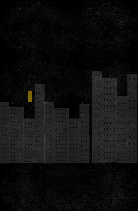
I normally finish my illustration in Illustrator before I begin working in Photoshop, where I complete things with brushes and textures. But that wasn’t the case here. Once I had a clear vision I began working with various elements that I already had, collage style, directly in Photoshop.
Now we have the background of the illustration.
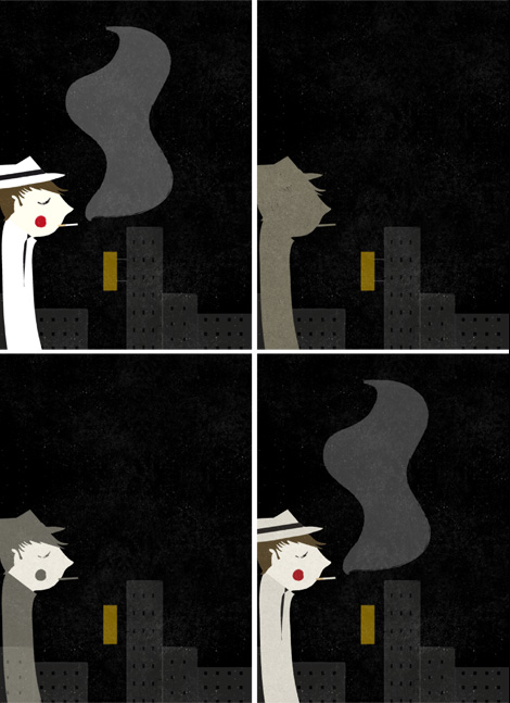
Once the background is defined I copy and paste the character from Illustrator. Evidently, the contrast of the vector character with the background is very ugly. It is time to find textures and to apply brushes to the character.
I choose the appropriate texture and silhouette the character. Then I duplicate and adjust the layers until I find a result that I like. I also color certain parts so that the result is not too plain.
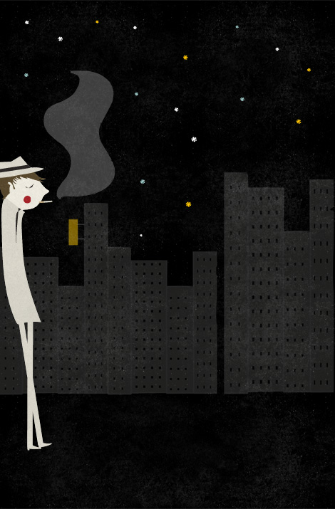
Finally we have the illustration, but it could use some life because it appears dark and sad. I add the stars that I started with in Illustrator and that is that last touch that it needs to come to life. The client chose another option that I presented.


